Boundless Energy Art Design

Boundless Energy Art Design
Welcome to "My Latest Work Experience as contract developer -November 2020" for the Kitsap Transit County Intranet website project,
where I played different rolls to accomplish their requirements in a five-week period.
Below you will find screenshots of the work requested. On the left-hand side is how the file was received,
and on the right-hand side is the work delivered.
One of the most important files I worked with, was the CSS. This file began with 149 lines of code when I did receive it.
When the total of twelve files were delivered, the CSS file contained about 2309 lines of code, that allows to behave
all pages as it was requested.
All this work was performed using the three technologies below mentioned.
Build with the latest version of HTML5
Build with the latest version of CSS3
Build with the latest version of Bootstrap 4
Fixes
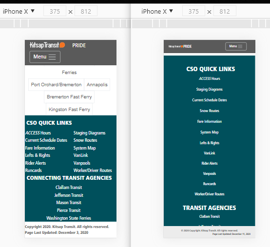
Menu: doble line and resizes fonts for medium and small screen sizes.
Carousel: standardized all three images with the same sizes;
-caption: added full width.
Green Section: Center aligned all placeholders with name & title.
Footer: Added background color, added sticky footer classes.
Media Queries: Added for all breakpoints and adjusted all classes impacted.
Fixes
Menu: Resizes fonts and hamburger image for medium and small screen sizes.
Caption: fixed and added full width.
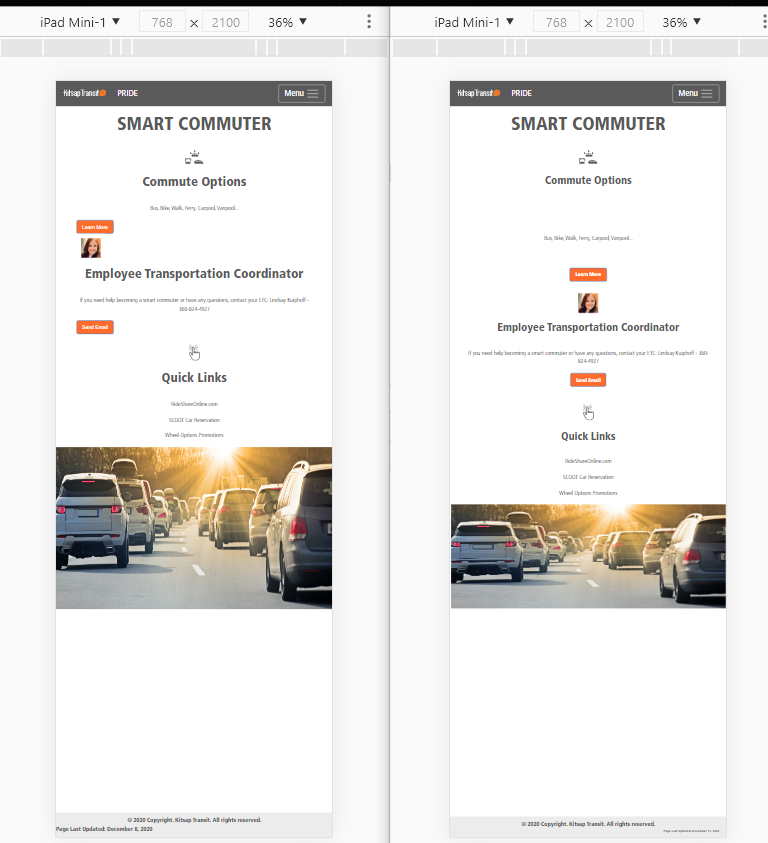
Fixes
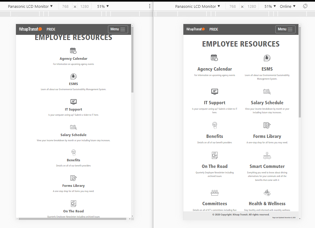
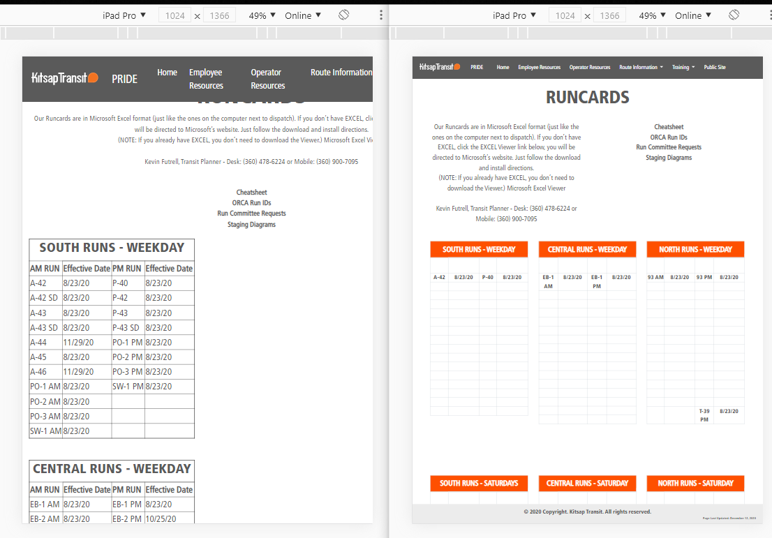
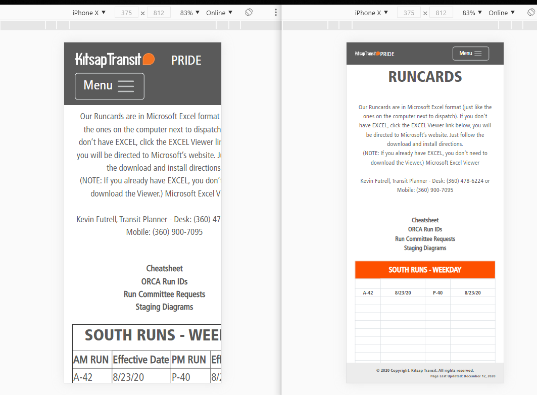
Menu: doble line and resizes fonts for medium and small screen sizes.
Title: Adjusted space below the menu.
Subtitles: Added background color in all three.
Left column: Indented all links.
Green Section: Center aligned all placeholders with subtitles and image placeholder's names.
Footer: Added background color, added sticky footer classes.
Media Queries: Added for all breakpoints and adjusted all classes impacted.
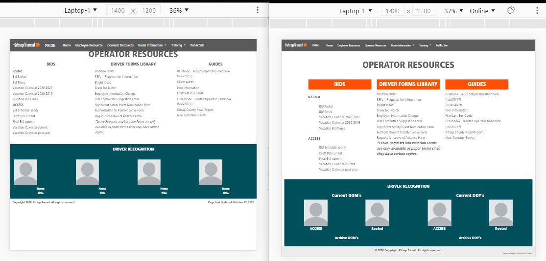
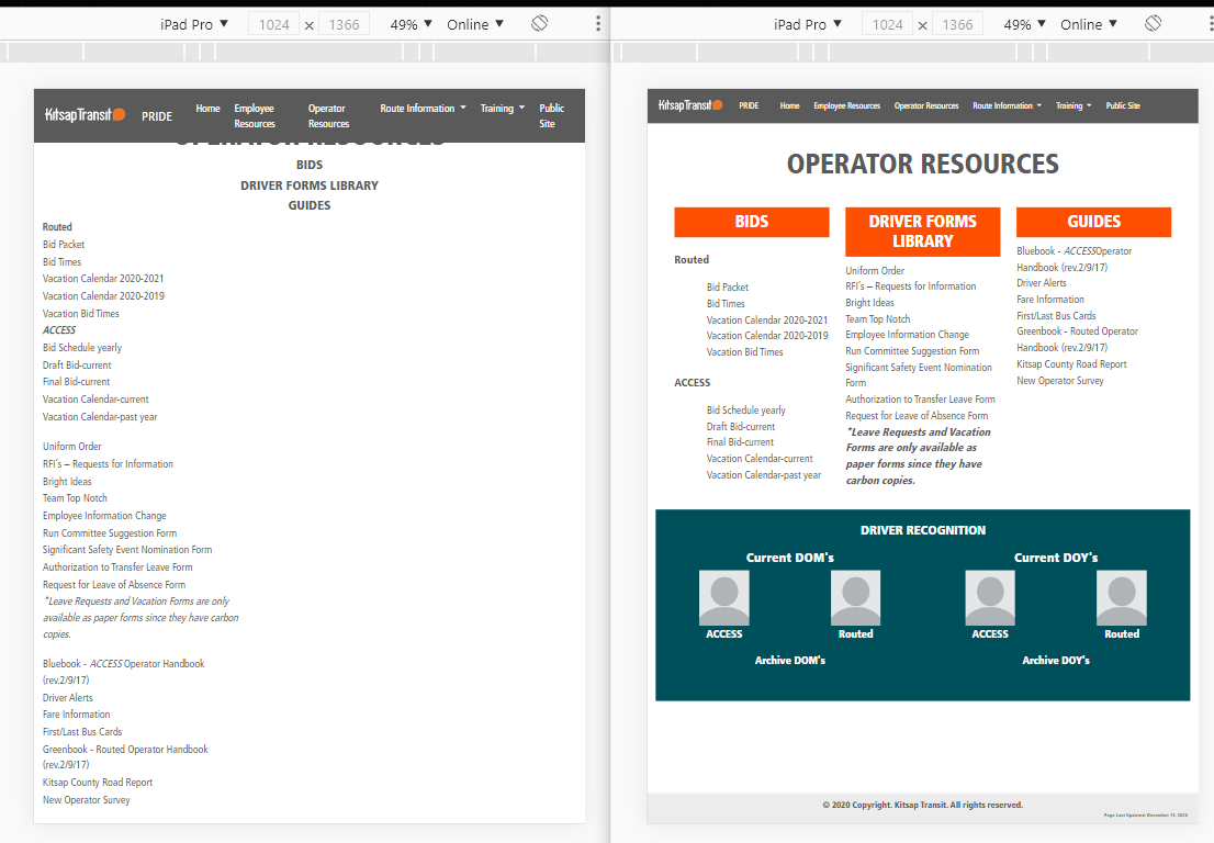
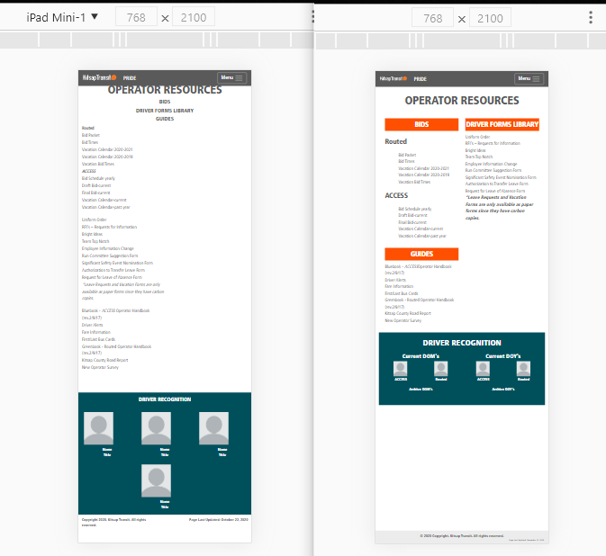
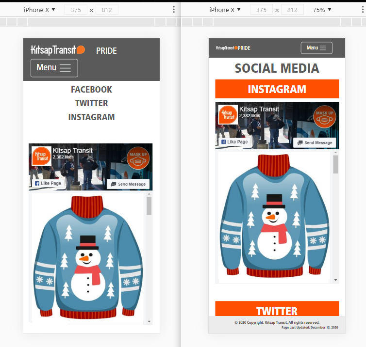
Fixes
Subtitles: inclued inside each column, and added background color.
Fixes
Green Section: Applied classes to resize and show those two columns for mobile size.
Fixes
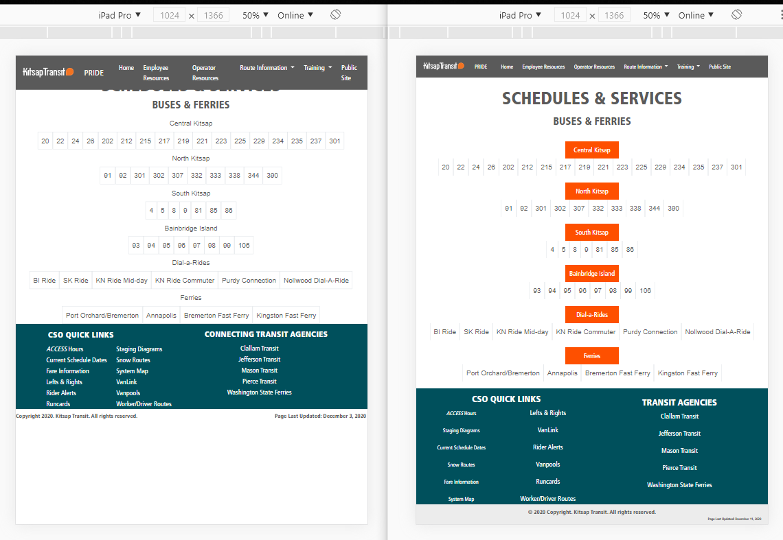
Menu: doble line and resizes fonts for medium and small screen sizes.
Title: Adjusted space below the menu.
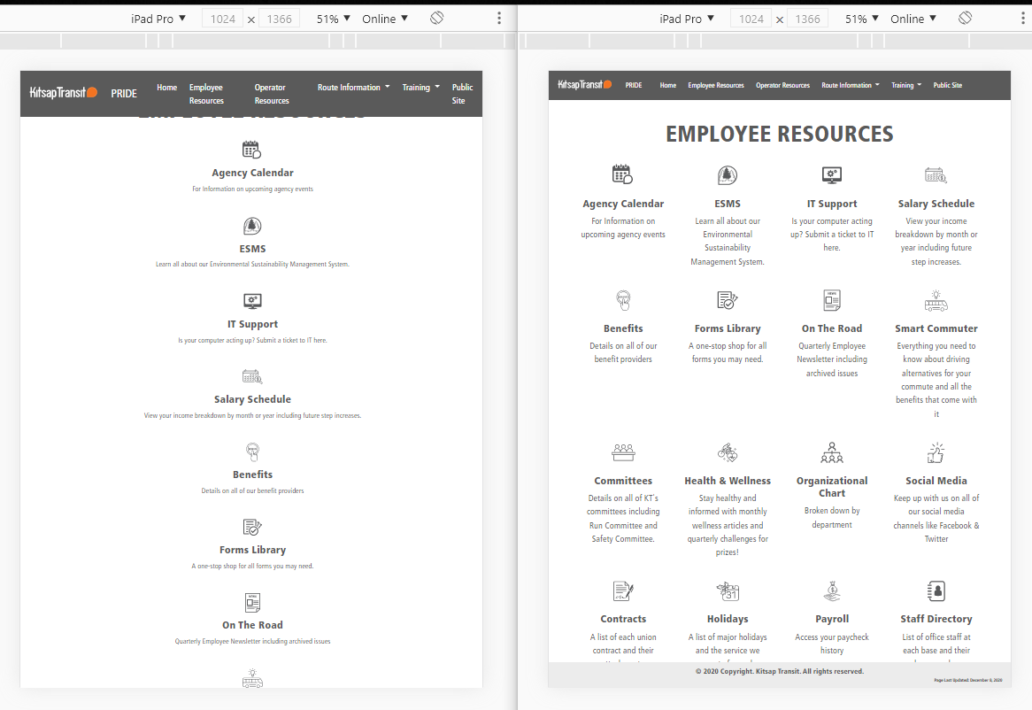
Four Columns: Redesigned to properly go from four columns to two and then one column for different screen sizes.
Footer: Added background color, added sticky footer classes.
Media Queries: Added for all breakpoints and adjusted all classes impacted.
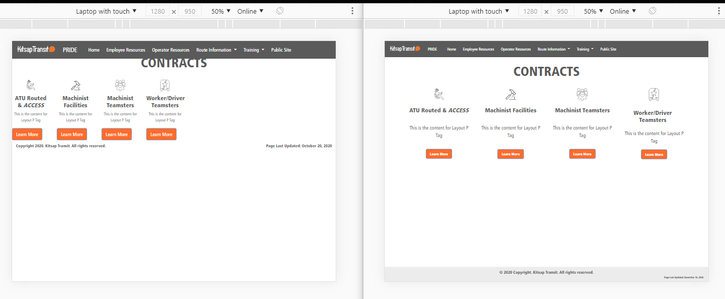
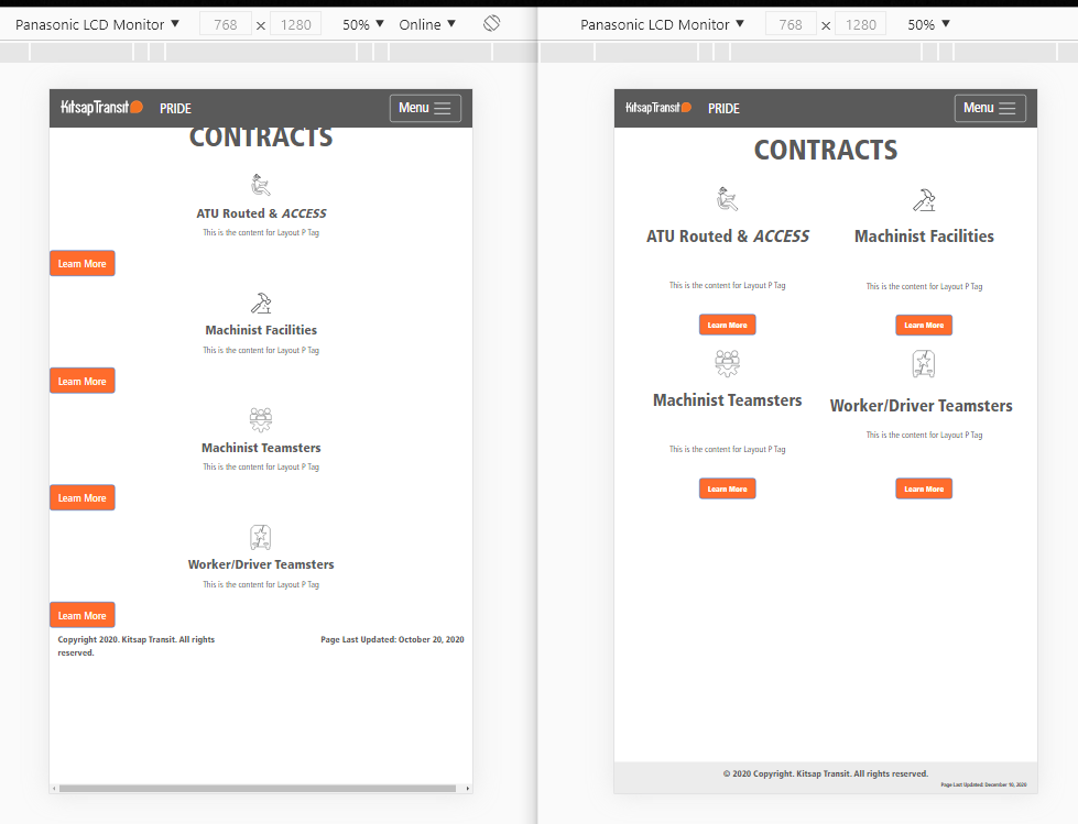
Fixes
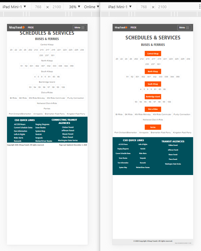
Four Columns: Redesigned to properly go from four clumns to two and then one column for different screen sizes.
Fixes
Menu: doble line and resizes fonts for medium and small screen sizes.
Title: Adjusted space below the menu.
Squares: Deleted top and bottom lines.
Subtitles: Added background color and resize all of them for the same width.
Green Section: Redesigned two columns with one nested two columns
allowing to go from two to one column for different screen sizes.
Footer: Added background color, added sticky footer classes.
Media Queries: Added for all breakpoints and adjusted all classes impacted.
Fixes
Subtitles: Added background color and resize all of them for the same width.
Green Section: Redesigned two columns with one nested two columns
allowing to go from two to one column for mobile sizes.
Fixes
Green Section: Redesigned two columns with one nested two columns
allowing to go from two to one column for mobile sizes.
Fixes
Menu: doble line and resized fonts for medium and small screen sizes.
Title: Adjusted space below the menu.
Content (above columns): Added two columns to display properly the text.
Three columns: Layout redesigned to center columns allowing to go from three to one column for different screen sizes.
Subtitles: Added background color and resize all of them for the same width on top of each column.
Footer: Added background color, added sticky footer classes.
Media Queries: Added for all breakpoints and adjusted all classes impacted.
Fixes
Menu: Resized fonts for medium and small screen sizes. Adjust hamburger image size and logo to reduce height size.
Three columns: Layout redesigned to center columns allowing to go from three to one column for different screen sizes.
Fixes
Menu: doble line and resized fonts for medium and small screen sizes.
Title: Adjusted space below the menu.
Four columns: Layout redesigned to center columns, allowing to go from four to two, to one column for different screen sizes.
Footer: Added background color, added sticky footer classes.
Media Queries: Added for all breakpoints and adjusted all classes impacted.
Fixes
Title: Adjusted space below the menu.
Four columns: Layout redesigned to center columns allowing to go from four to two, to one column for different screen sizes.
Bottom Scrollbar: Added a class to deleted.
Fixes
Menu: doble line and resized fonts for medium and small screen sizes.
Title: Adjusted space below the menu.
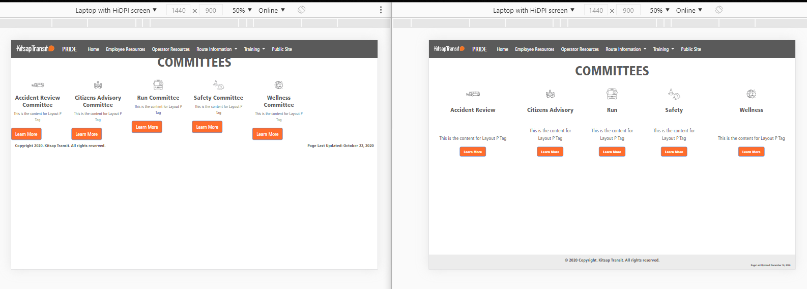
Five columns: Layout redesigned to center columns, allowing to go from five to two, to one column for different screen sizes.
Footer: Added background color, added sticky footer classes.
Media Queries: Added for all breakpoints and adjusted all classes impacted.
Fixes
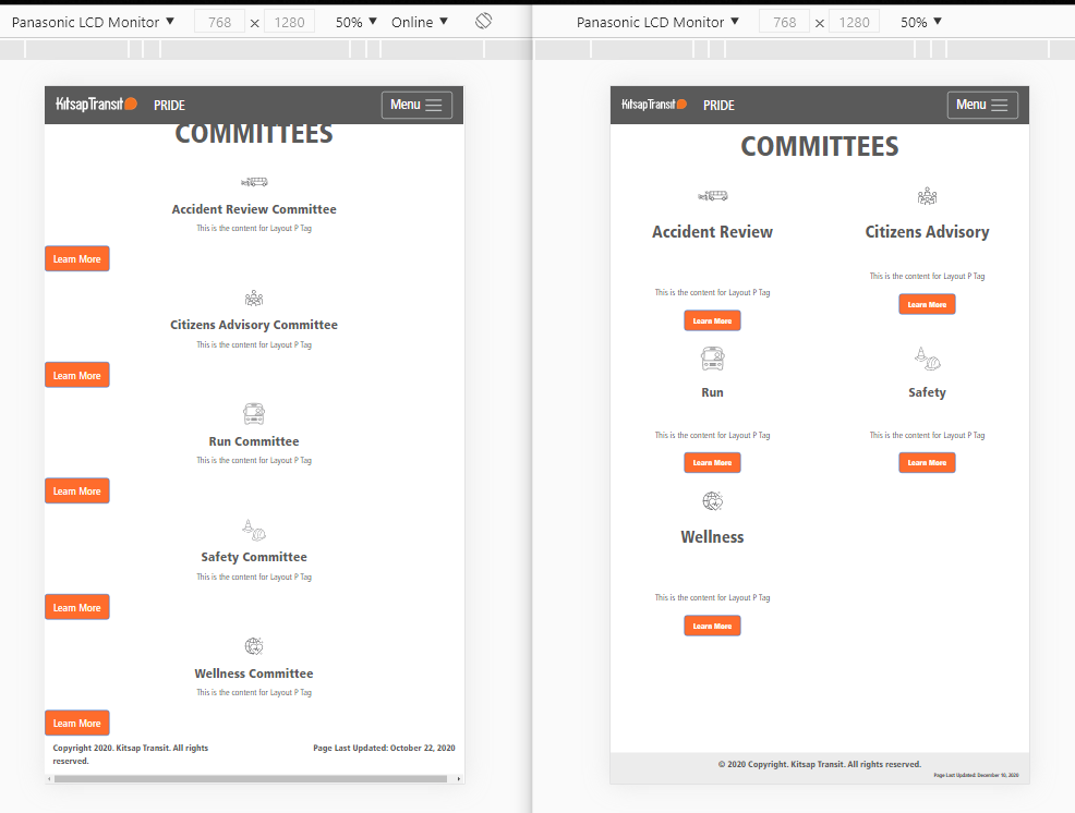
Menu: doble line and resized fonts for medium and small screen sizes.
Title: Adjusted space below the menu.
Five columns: Layout redesigned to center columns, allowing to go from five to two, to one column for different screen sizes.
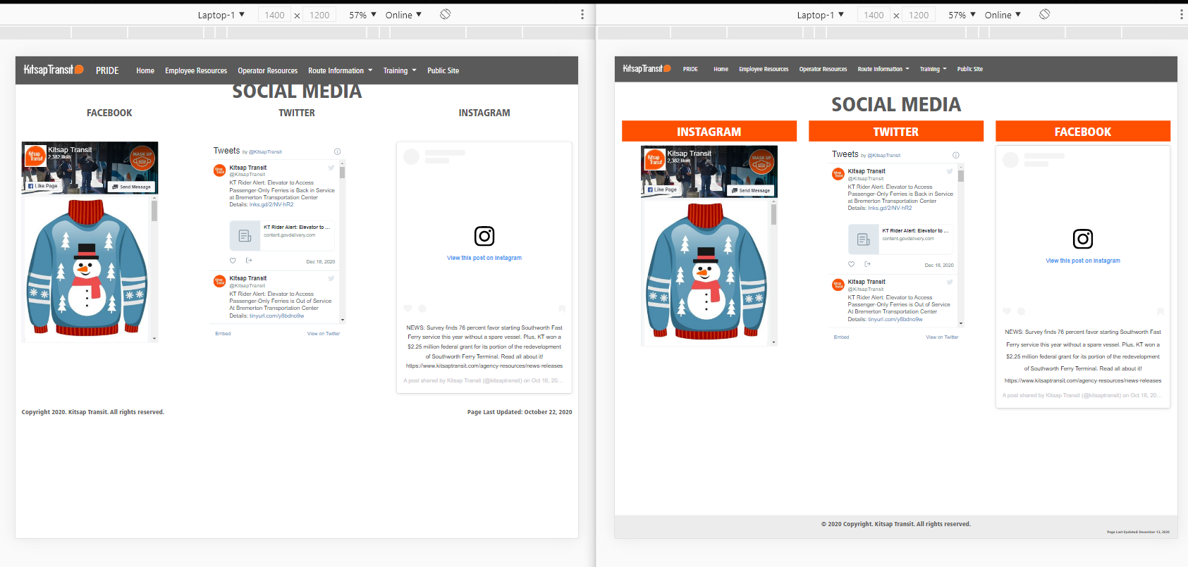
Fixes
Title: Adjusted space below the menu.
Three columns: Redesigned the layout to center them, allowing to go from three to one column for different screen sizes.
Subtitles: Included all three inside each column.
Added background color and resize all of them for the same width on top of each column.
Footer: Added background color, added sticky footer classes.
Media Queries: Added for all breakpoints and adjusted all classes impacted.
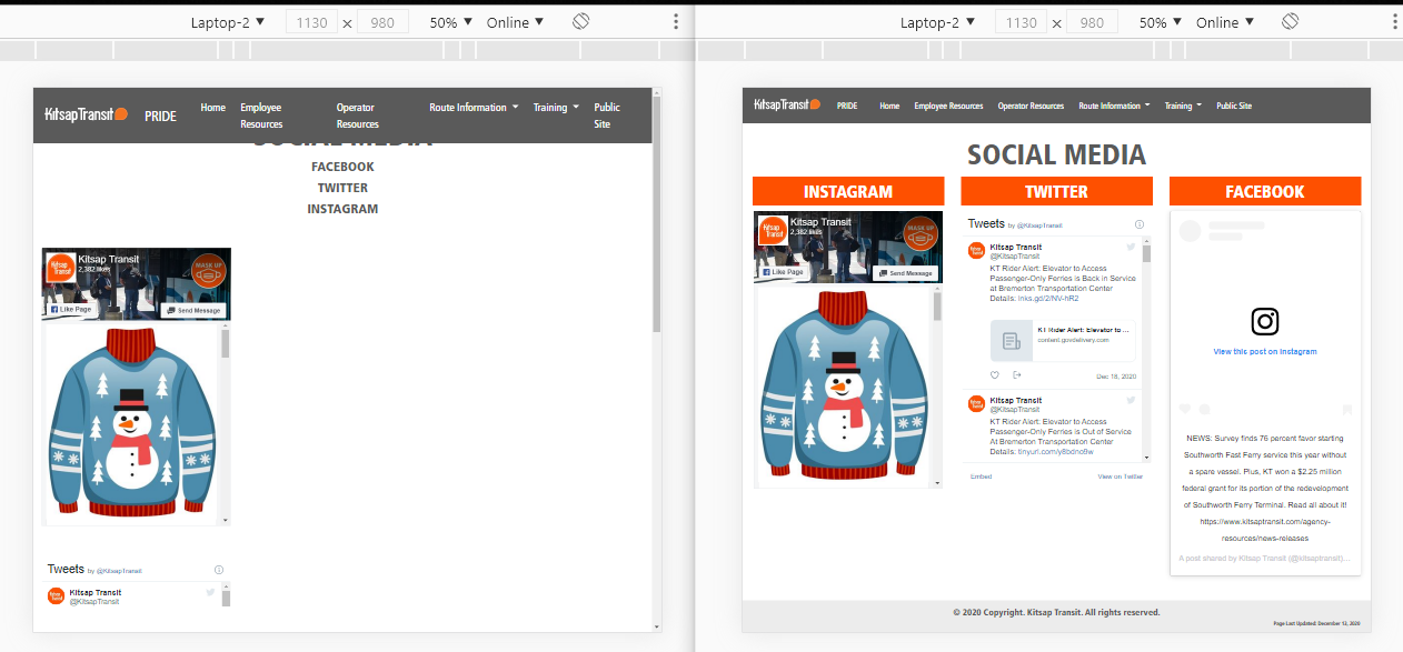
Fixes
Menu: doble line and resized fonts for medium and small screen sizes.
Subtitles: Added background color and resize all of them for the same width on top of each column.
Fixes
Menu: Resized fonts for medium and small screen sizes. Adjust hamburger image size and logo to reduce height size.
Subtitles: Added background color and resize all of them for the same width on top of each column.
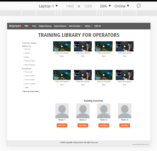
Designed
Design: Full design from scratch the entired page with two columns, devided in two sections.
Top Section -Left column: Selectred menu with radiobuttons.
Top Section -Right column: Contains four columns and two rows of eight embeded videos,
each video has below its title and hero in two lines of text,
allowing to go from two to one column for different screen sizes.
Bottom Section -Left column: Training instructor
Bottom Section -Right column: Contains four colmns with Image placholders for future use.
Footer: Added background color, added sticky footer classes.
Media Queries: Added for all breakpoints and adjusted all classes impacted.
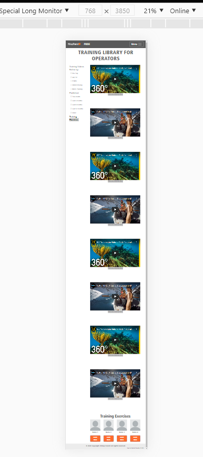
Designed
Bottom Section: Due to lack of information for the content, the four columns displays on mobile devices.
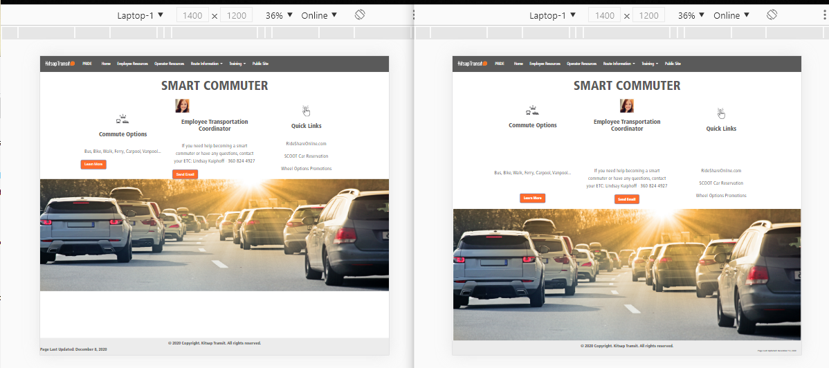
Fixes
Three columns: Redesigned the layout to center its content properly, horizontal and vertically, allowing to go from three to one column for different screen sizes.
Image at the bottom: Added a class to allow it to resize properly in all different screen sizes.
Media Queries: Added for all breakpoints and adjusted all classes impacted.
Fixes
Image at the bottom: Added a class to allow it to resize properly in all different screen sizes.